Home › Mac Apps › Affinity Publisher

Affinity Publisher 2.6.5 (Mac)
Updated
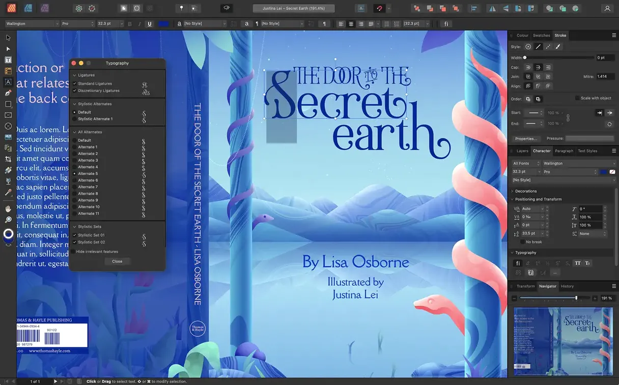
The catalogue note
Desktop publishing can be a messy business when you are juggling multiple page sizes, fold types, and export presets across a single document. It sits alongside Affinity Designer and Affinity Photo, sharing a common engine through StudioLink, which lets you switch between vector, raster, and layout tools without leaving the working file.
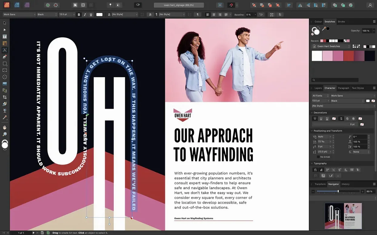
Version 2.6 introduces a few structural additions that matter to real-world print workflows. Multiple-page spreads now let you work on facing pages across a whole signature, and foldable spreads add gatefolds, trifolds, and accordion folds natively in the layout — no manual trickery needed. The new Reading Order panel helps tag PDF exports for accessibility, which is increasingly required by publishing standards.
People often ask whether the software runs on both Intel and Apple Silicon — it does, requiring at least macOS 10.15 and 8 GB of RAM. The disk image installs via a simple drag-to-Applications process, with a one-time Gatekeeper bypass. Text controls cover drop caps, initial words, and table formatting, and export goes up to PDF/X-4. If you already own the other Affinity apps, Publisher folds them in without separate launches.
Adjust defaults before starting a project
Before starting a project, a few defaults are worth adjusting. Open the app's preferences and head to the General section. The 'Create new document with defaults' option saves you from repeating the same page size and margin setup every time. If you mostly work on A4 brochures or US Letter magazines, set that once and move on.
In the Interface section, the 'Show transformation panel' toggle can stay on — you will need it for precise positioning. Turn off 'Show contextual toolbar hints' unless you are still learning the icons; they take up space without adding much after the first week. The grid and snapping settings live under the Grid and Snapping section. Set a baseline grid for your body text size early — 12 pt text with a 14.4 pt baseline is a common starting point — and Publisher will keep lines aligned across columns and spreads.
For colour work, check the Colour preferences. If your output goes to a commercial printer, set the default colour format to CMYK and choose a CMYK profile that matches your press. Spot colour support and Pantone libraries are already available, but they only work correctly if the document colour format is set before you place any swatches. Changing it halfway through a layout can shift values in unexpected ways.
Building a three-page print brochure from scratch
Start with a new document. Choose Print from the preset list, set the page size to A4 (or your preferred trim size), and enable Facing Pages. Under the Layout section, enter 3 for the number of pages — a simple trifold fits into three physical panels. Version 2.6's foldable spreads feature handles the fold itself: set the spread type to Trifold and Publisher creates the correct panel widths and fold lines automatically.
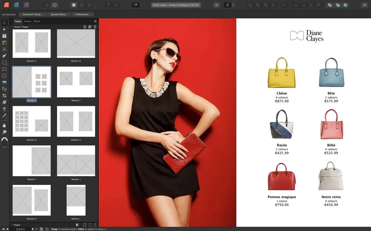
Open the Master Page panel. Create a master called 'Content' with a two-column text frame and a header area. Add a second master called 'Cover' for the front and back panels, with a full-bleed image frame. Apply the Content master to pages 2 and 3, and the Cover master to page 1. Nested masters work here: if you need a common footer across all pages, create a third master with the footer and nest it into both Content and Cover.
Place your text. For a brochure, you typically have copy that flows from panel to panel. Draw a text frame on the first content page, paste or import the text, then link the frame to the next page's text frame by clicking the red overflow arrow and clicking into the next frame. Repeat until all copy is placed. Apply paragraph styles as you go — set up a Body style at 10 pt with 12 pt leading, and a Heading style at 16 pt bold with a rule below.
Add images. Drag a photo from Finder into the image frame on the cover master. For the inner pages, place images inline or in separate picture frames. Use the Text Wrap panel to set the wrap offset — 3 mm around each image keeps text readable without crowding. Check the 'Ignore text wrap when text is above' option if you have layered elements.
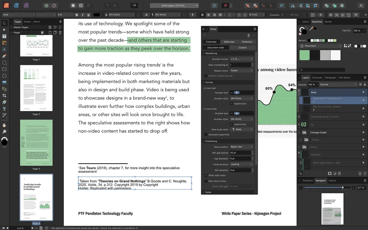
When the layout is complete, export to PDF. Use the PDF/X-4 preset for most print shops. If your printer requires PDF/X-1a or PDF/X-3, those are also available in the export dialog. Before exporting, open the Reading Order panel from the Window menu. Drag each element into the correct reading sequence — this matters for screen readers and accessibility compliance.
StudioLink lets you edit vectors and photos without leaving Publisher
StudioLink is the main bridge. Open Publisher and you can switch to the Designer persona for vector work or the Photo persona for raster editing, all inside the same document. No need to export layers or re-import files. If you have both Affinity Designer and Affinity Photo installed, their full tool sets become available inside Publisher's interface. For someone who does layout and illustration in the same project, this removes the back-and-forth entirely.
Outside the Affinity ecosystem, Publisher reads PSD, AI, and PDF files natively. A designer can send you a layered Photoshop file, and you can place it directly into a layout without flattening. The non-destructive adjustment layers carry over, so you can tweak exposure or colour balance after placing the file.
macOS features like Quick Look work with Affinity Publisher files — you can select a document in Finder and press Space to preview the first page. The system-wide colour picker also works inside Publisher, so you can sample colours from other apps and paste the hex or CMYK values into the Colour panel. If you use Apple's built-in dictionary or text services, those carry into text frames as well.
For font management, Publisher reads from the standard macOS font folders. If you use a font manager like Font Book, any activated font appears in the font list immediately. No special configuration needed.
Master pages save beginners from hours of manual updates
The most common one is ignoring master pages. Beginners often place headers, page numbers, and background elements manually on every page, then spend hours updating them when something changes. Master pages exist exactly to avoid this. Set up your repeating elements once, apply the master, and edit the master when the client asks for a different font in the footer. All pages update automatically.
Another mistake is forgetting to link text frames. When you paste a long article into a single frame, the text stops at the bottom of the frame and the rest becomes invisible. The red overflow indicator in the bottom-right corner of the frame tells you there is hidden content. Click that indicator, then click into an empty frame on the next page — the text flows across. Beginners who miss this step end up with half-finished articles and no obvious reason why.
Beginners also tend to place images at full resolution and scale them down inside the frame. This works, but it bloats the file size. Better practice: resize images in an external editor or in the Photo persona before placing them, or use the Resource Manager to check the effective DPI of each placed image and replace oversized ones. Publisher reports the DPI in the Resource Manager panel — anything above 600 DPI for a print document is usually wasted.
Export settings trip people up too. The default PDF export might include everything in the document, including hidden layers and guides. Before exporting, check the Areas section in the export dialog and select 'All pages' or a specific range. Uncheck 'Include hidden layers' unless you need them. If you are sending files to a printer, also verify that the colour space matches what the printer expects — CMYK for offset, RGB for some digital presses.
Finally, many new users skip the baseline grid entirely and align text by eye. The result looks acceptable on screen but shows uneven line spacing when printed. Turn on the baseline grid from the View menu, set it to match your body text leading, and snap your text frames to it. The difference in a printed proof is immediate.
Changes in this build
- Added multiple-page spreads in the 2.6 release.
- Added foldable spreads such as gatefolds, trifolds, and accordion folds in the 2.6 release.
- Added a Reading Order panel for PDF accessibility in the 2.6 release.
Before it goes on the Mac
- macOS 10.15 or later
- Intel or Apple Silicon
- 8 GB RAM recommended
- Up to 2.8 GB of available hard drive space (more during installation)
- Display size 1280 × 768 or larger
Installing it on the Mac
- Mount the disk image and run Open Gatekeeper friendly.
- Press Enter in Terminal to bypass Gatekeeper.
- Drag the app to the Applications folder.
- The app is ready to use.
Notes from the control room
Sign in or open a catalogue account to leave a note.
No notes from the room yet. If you have used this build for a week, a short note helps the next person.
Also filed under Mac Apps
The whole Mac Apps rack Affinity Photo2.6.5 Mac Apps 789 MB
 Affinity Designer2.6.5 Mac Apps 779 MB
 Adobe Substance 3D Painter12.1.5 Mac Apps 3 GB
 Adobe Premiere Rush1.5.62 Mac Apps 1.6 GB
 AI Transcription2.16 Mac Apps 5.1 GB
 Aiarty Image Enhancer3.14 Mac Apps 129 MB
 Adobe Photoshop28.0.0 Mac Apps 3.5 GB Updated
 Adobe Lightroom Classic15.6.0 Mac Apps 3.7 GB